Hope your week is going good.
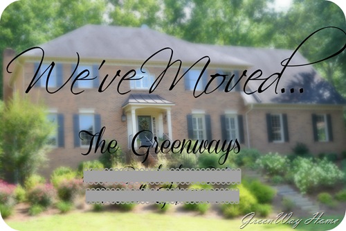
Finally my day to day life has gotten to a point where I could take some time to create our moving card to send out to friends & family to let them know our new address. I wanted to make it more personal by including a picture of the front of our home, but blur it out quite a bit so the words were the focus.

{here is the picture I chose, unedited}
I used picmonkey with different options to add just a focal point to the front door {since that’s where you greet your guests} and blur out the rest of the photograph. I really love picmonkey! I have photoshop elements, but these days, I find I just use picmonkey since I can pretty much do almost any kind of editing I need to in one place. After I had the picture blurred, I tried different font combinations. I really love a swirly script, but since this is an address card, I didn’t want there to be any possibility that it wouldn’t be completely legible. I am pretty pleased with how it all turned out.

I selected an extra-large postcard on recycled paper from vistaprint’s site. They are really very reasonable cost for quite a bit of quantity. They are all addressed now and ready to be mailed. Address cards, check. {Are you a list checker-offer, too?}
So now on to the next project…


No comments:
Post a Comment